Saatchi London UX/UI
SKILLS:
UX/UI, Web Design, Mobile Design, Motion
CLIENT:
Saatchi & Saatchi London
ROLE:
UX Designer, Designer
YEAR:
2017
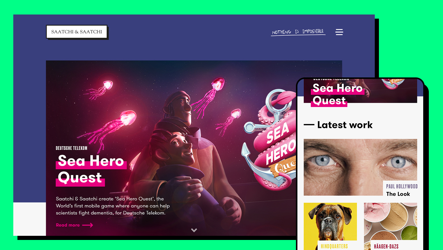
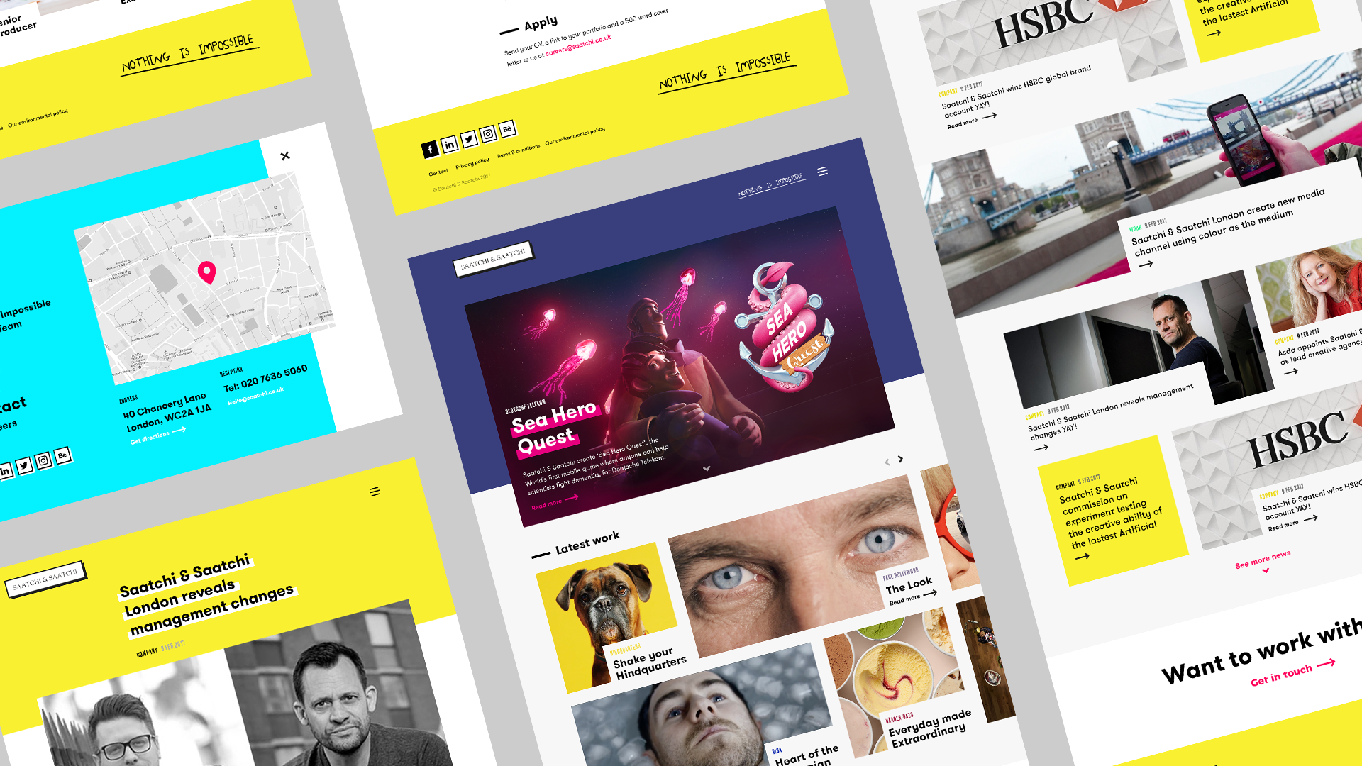
Improving on the impossible.
I was tasked to look at how to improve the Saatchi & Saatchi London website as part of an overall rebrand for the companies head office. The website is the agency’s main online presence and the showcase for their work. The Brief: make the website a tool to attract new business and new talent.
I was the lead on the UX design phase, completing a UX analysis including creating personas, user journeys, interviews and developing the sitemap and wireframes for the site. Working into the Head of Design and getting to present to key stakeholders in the agency to explain my insights and recommendations. Leading on to the design side where my knowledge of the project for the start was used to design the site along with another designer to deliver the project from start to finish.
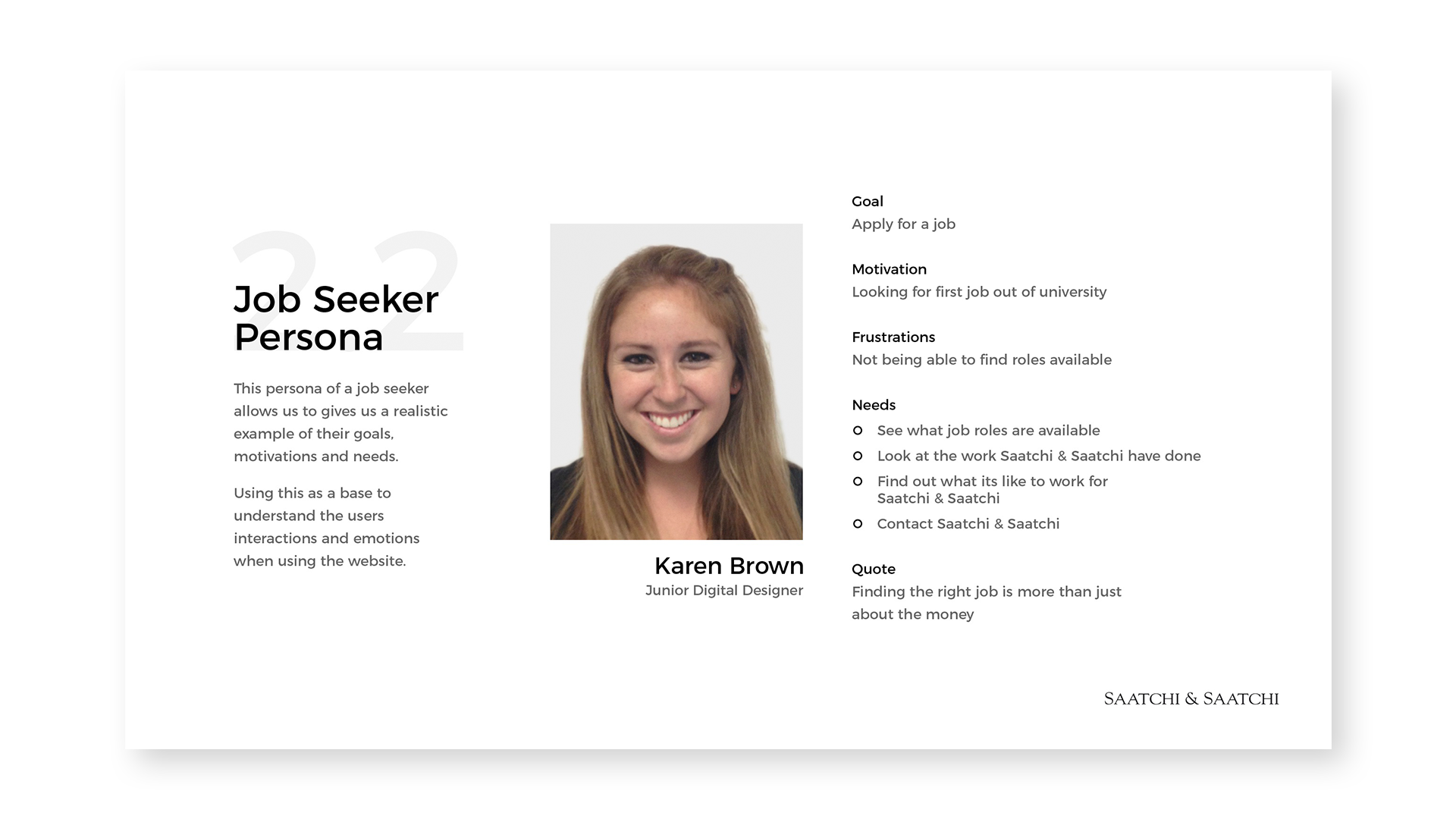
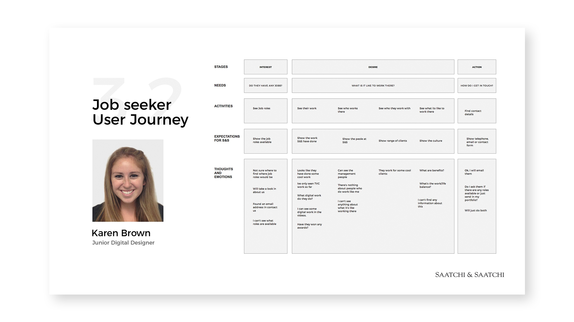
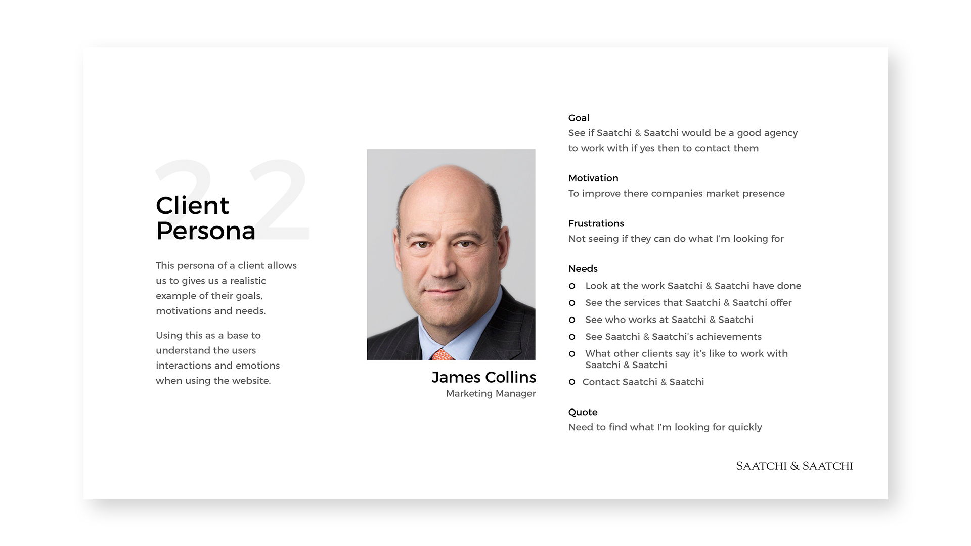
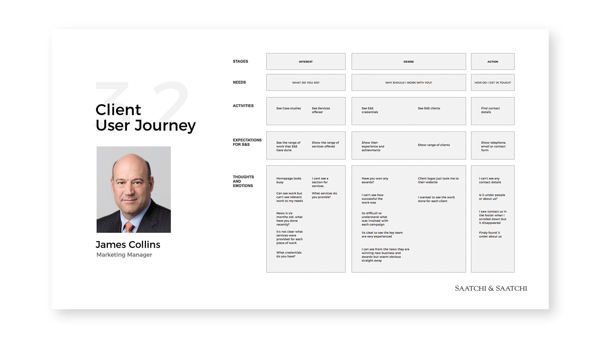
UX Analysis
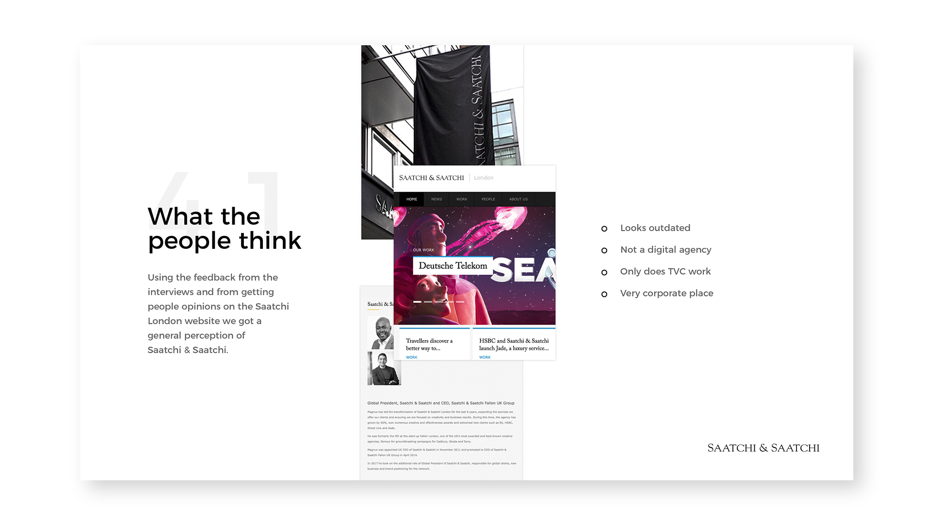
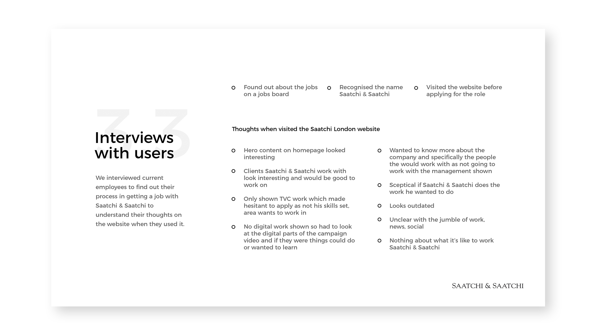
We had identified the types of users from the brief, new clients and new talent. Next I created personas for each of the users, to understand their goals and reasons for visiting the site. Taking these personas I performed user journeys of the current site. Finally I conducted interviews with current employees to see what their experience of using the website was when applying for a job.
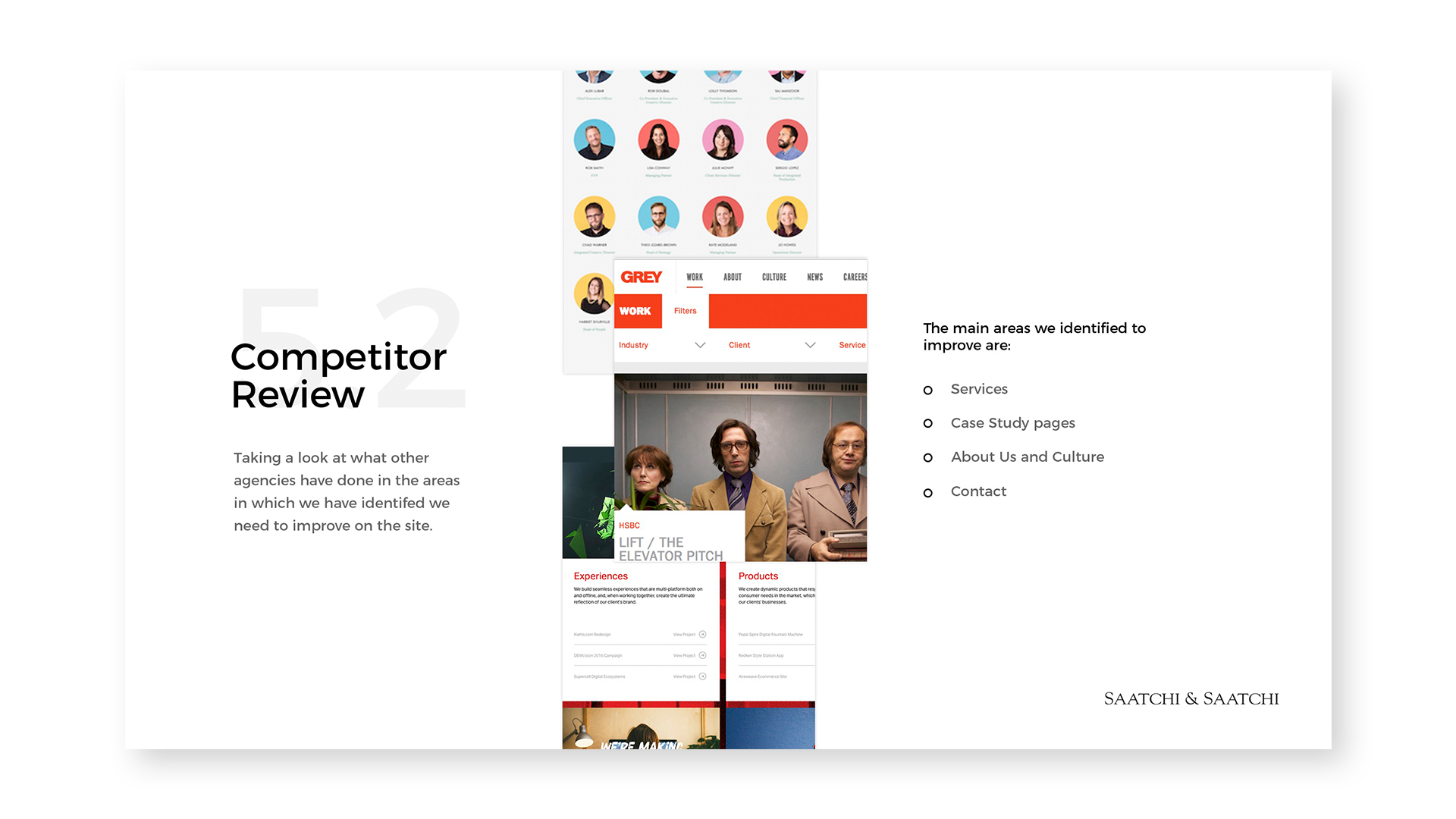
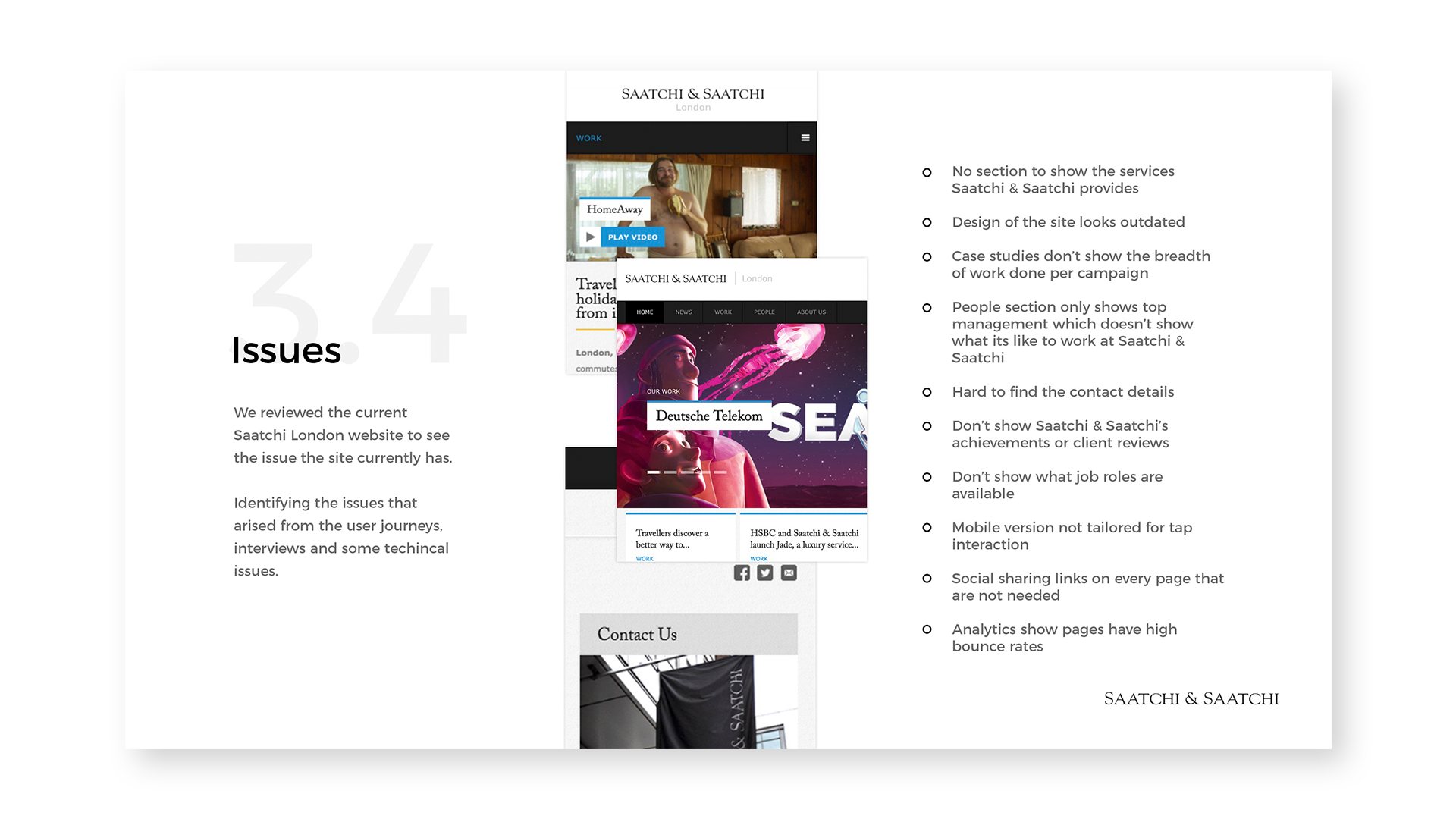
Using this data I identified the issues and perceptions of the current site, and then completed a competitor analysis to see how others are fixing these issues.

Wireframes
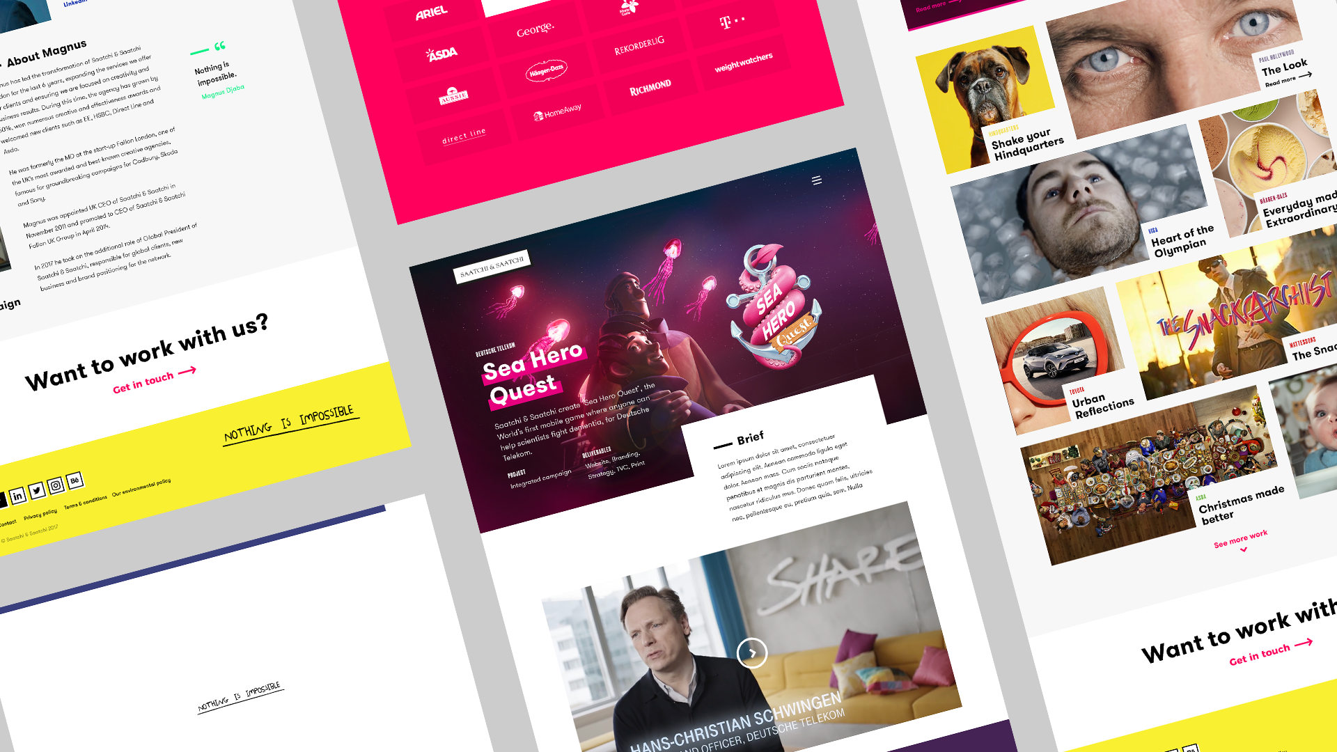
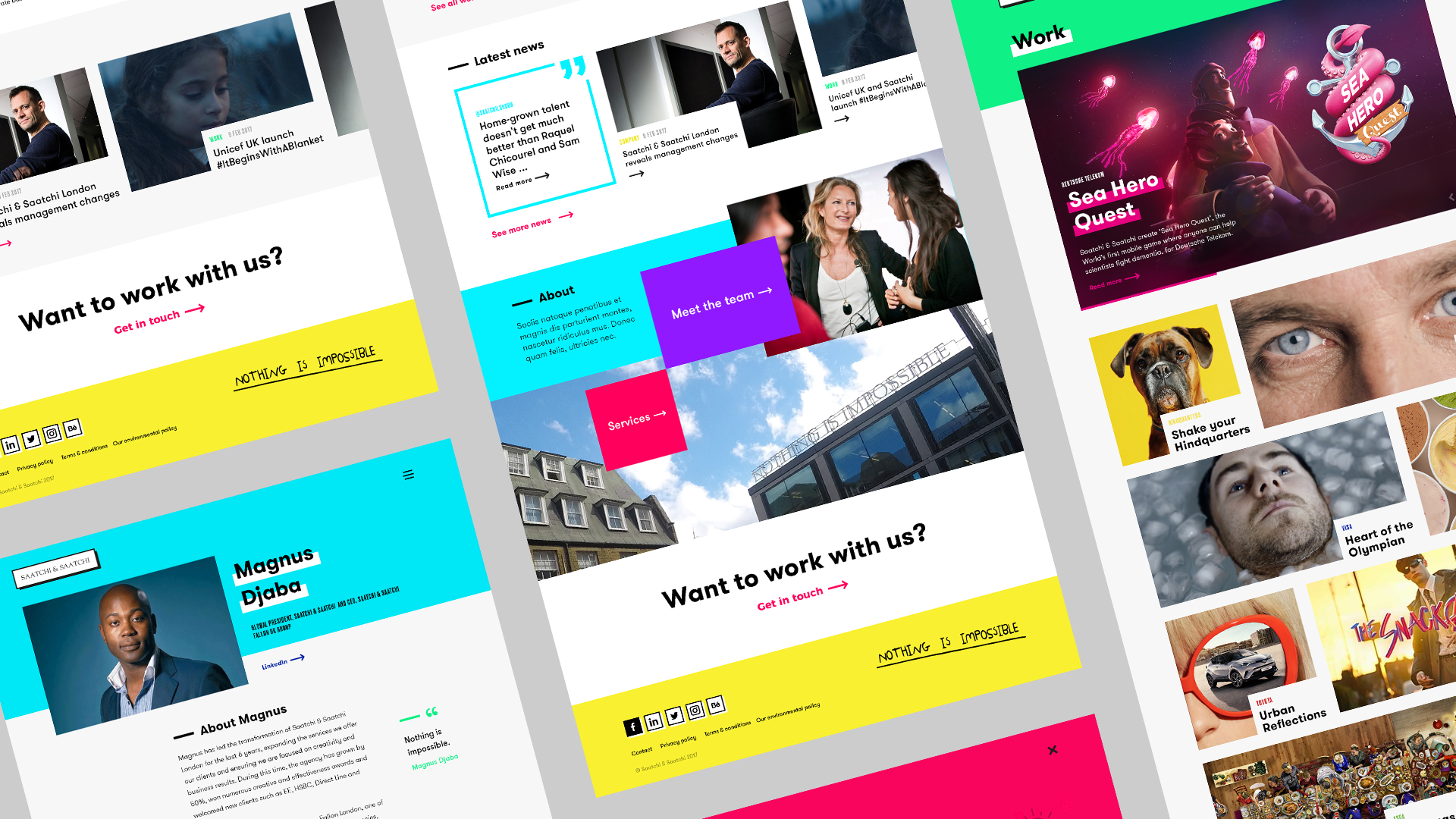
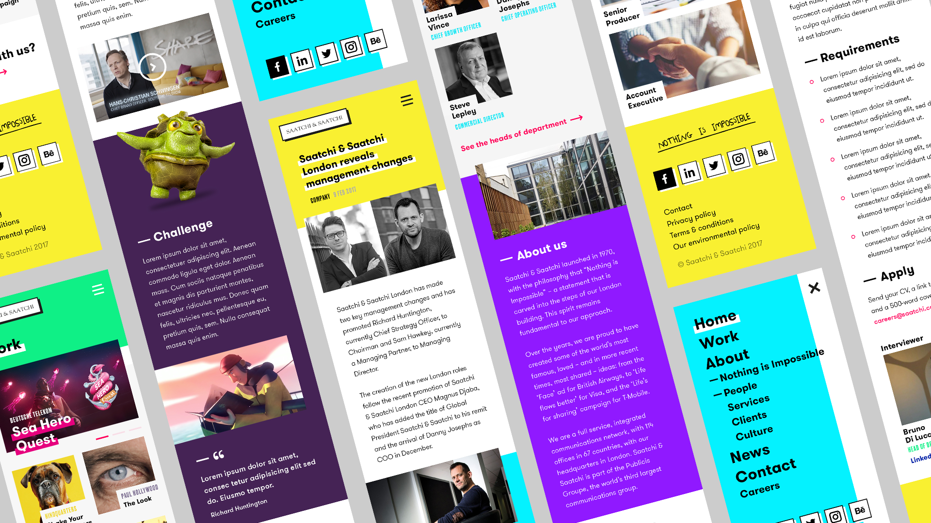
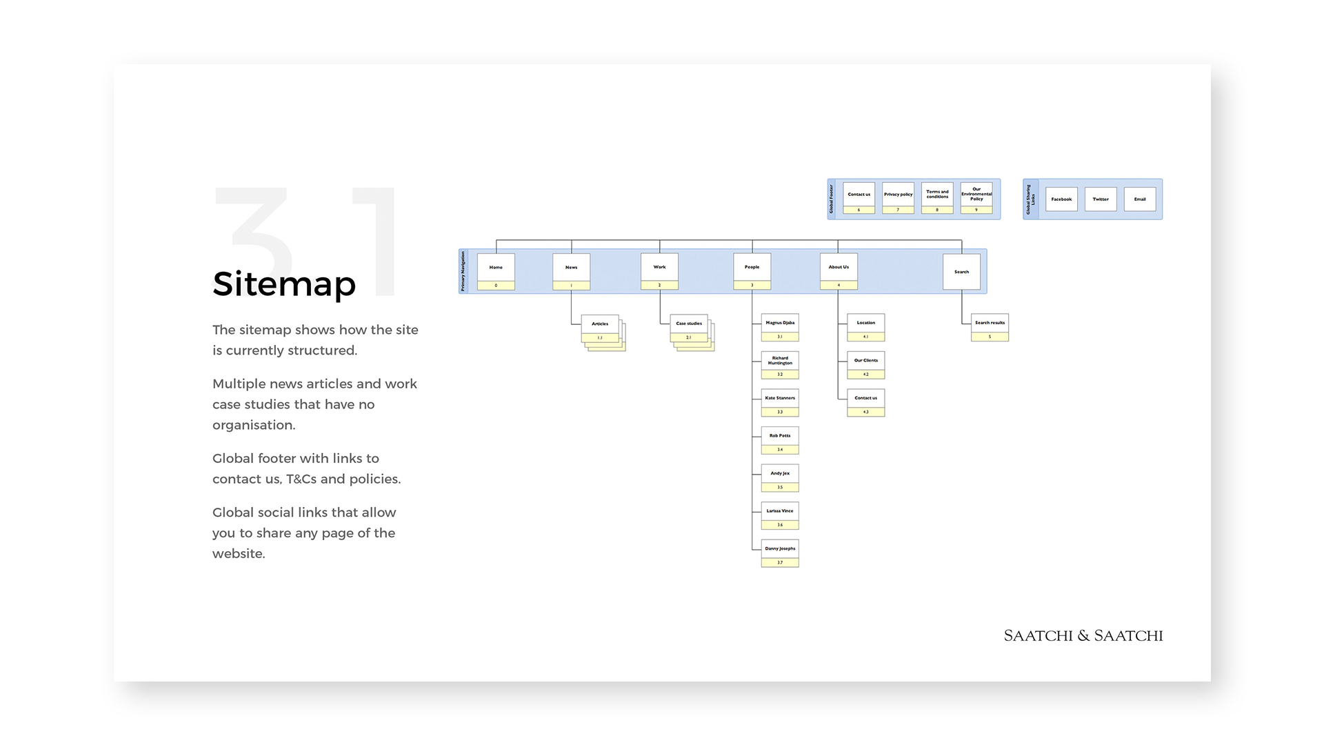
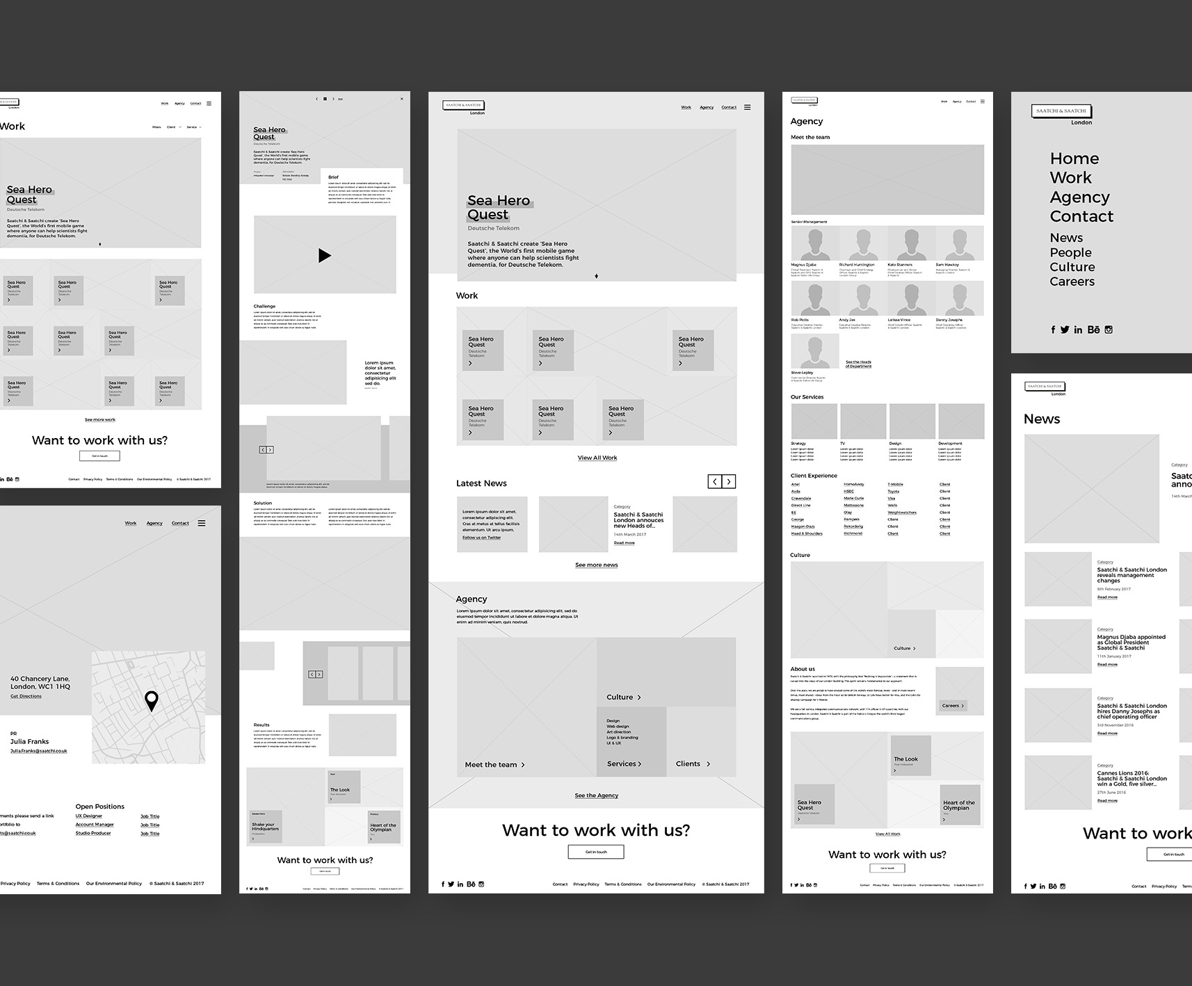
Once we got an understanding of the users needs and had identified the current issues. I created a sitemap that would make the core content the users are looking for easy to find while making sure other content was still accessible. Now we had the site structure I created wireframes for all the different sections of the site, following a mobile first approach, this allowed for a clearer understanding when presenting to stakeholders that helped them to visualise the new site.
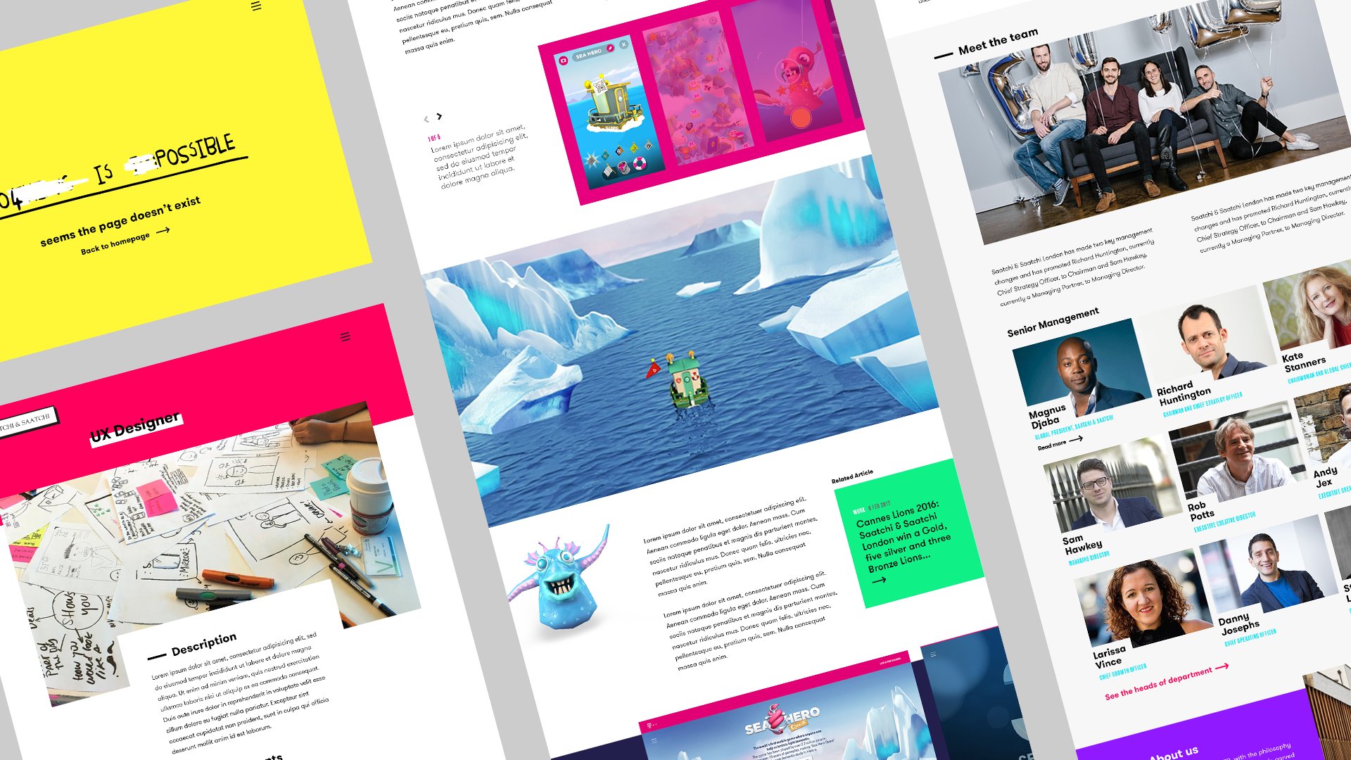
Motion
I looked into how we can bring motion into the site, from interaction with the content, scroll reveal, page transitions and loading. We wanted to keep the asymmetric feel even with the motion, this meant not doing your typical hover state change inside the box. This allowed to create pleasant subtle motions revealing content on interaction. As an extra bit of fun I motioned the Saatchi logo, this would animate showing the office location of London then resetting back to Saatchi & Saatchi.