ZOE Branding Campaign
SKILLS:
Branding, Print, Digital, Motion
CLIENT:
ZOE Clothing
ROLE:
Designer
YEAR:
2019
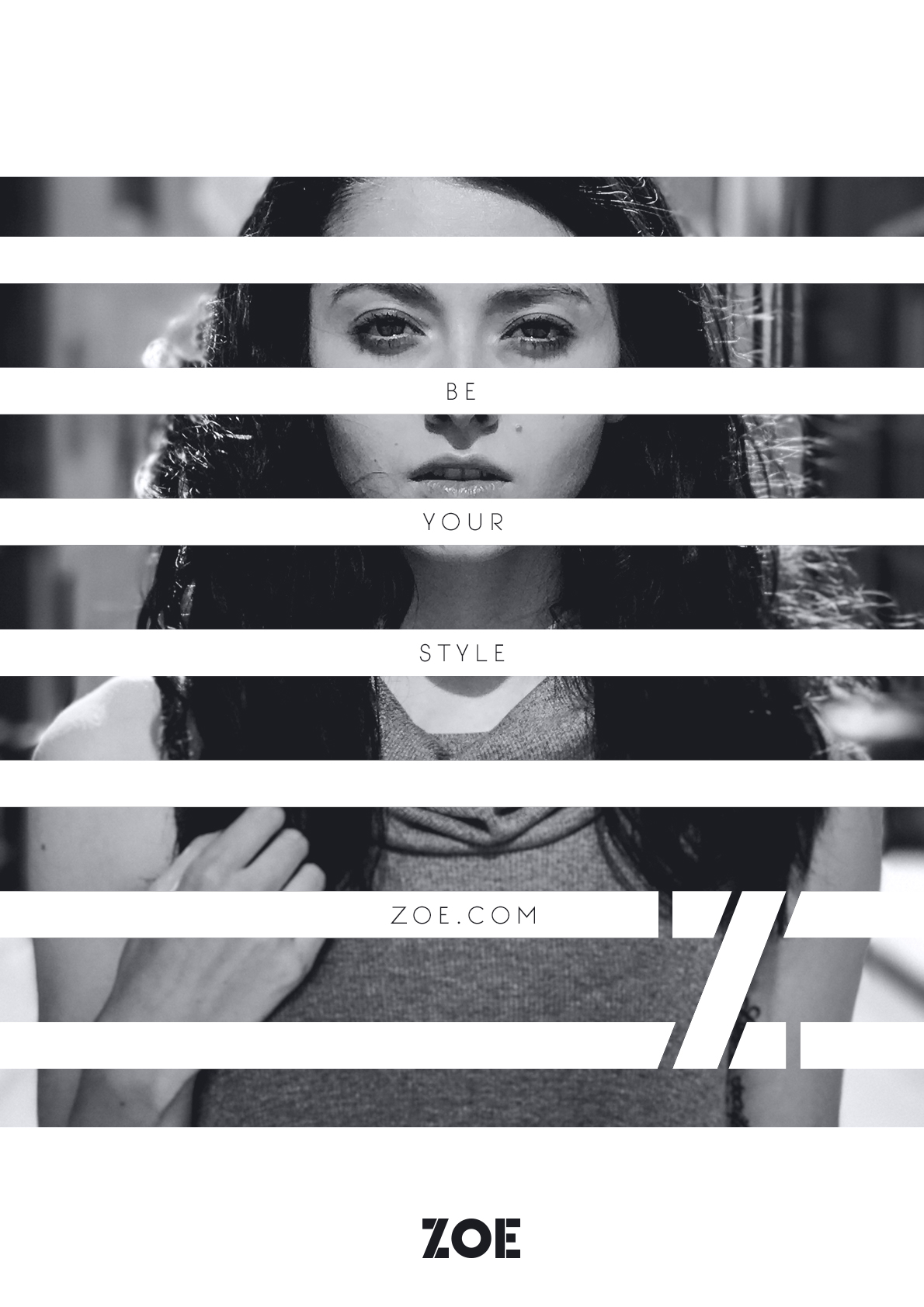
Visual identiy and campaign for the brand's relaunch.
My friend asked me if I would be interested in designing the visual identity for her mom's new clothing store. The brief was to create a look that would appeal to people ranging from teenagers to adults, something that would stand out from the crowd.
I started look up what other fashion brands have done, seeing a clean simple approach with an elegance to it. I then looked at branding used to target young adults, they are bold, visually stirking and use bright colours. Using both of these as a guide i explored the visual identity, taking elements from each approach and putting then together into a unique brand that is bold, modern and engaging.
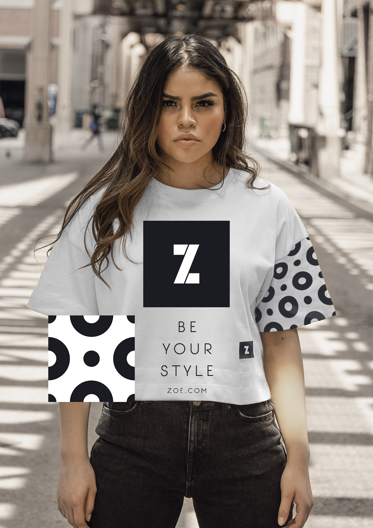
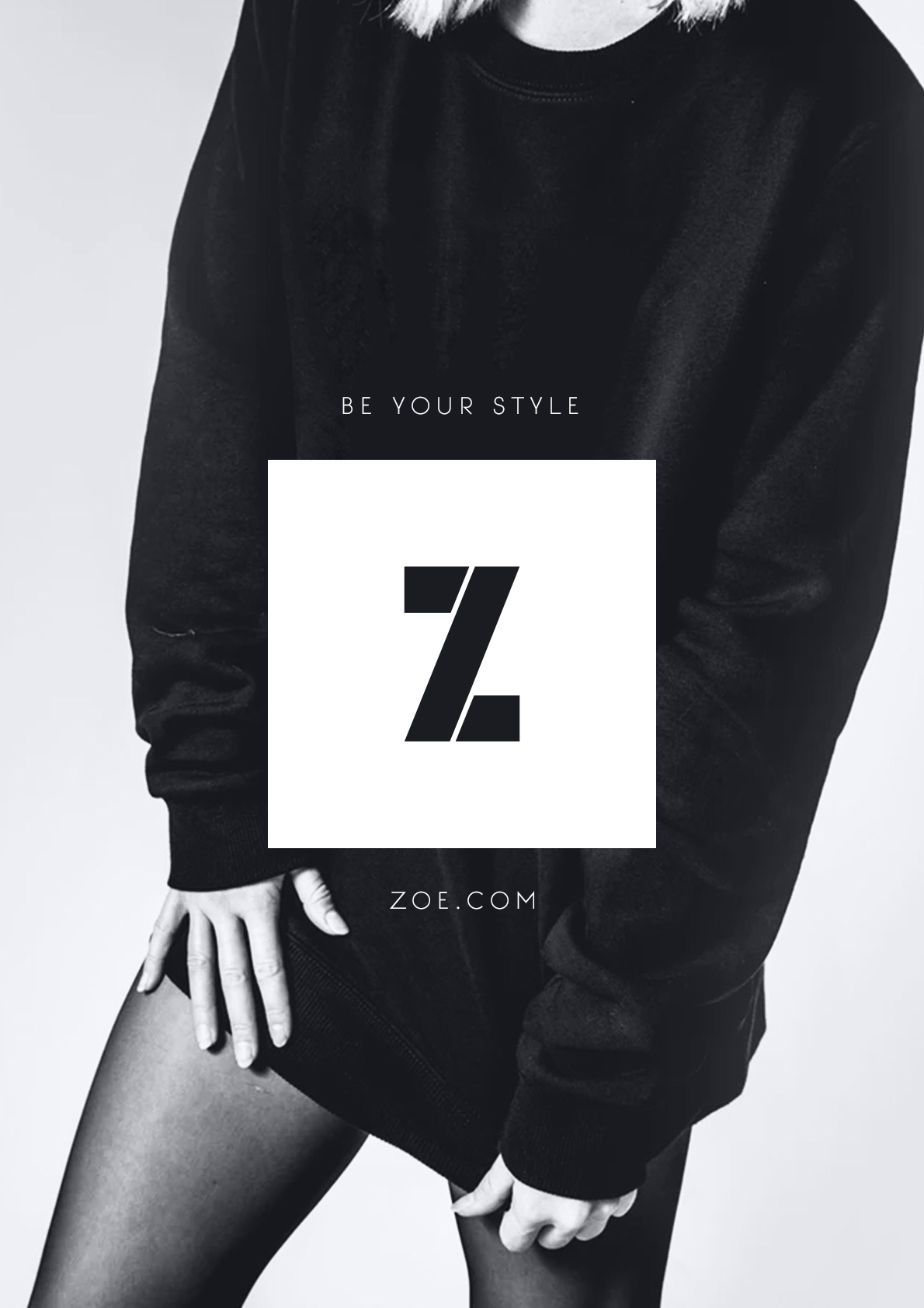
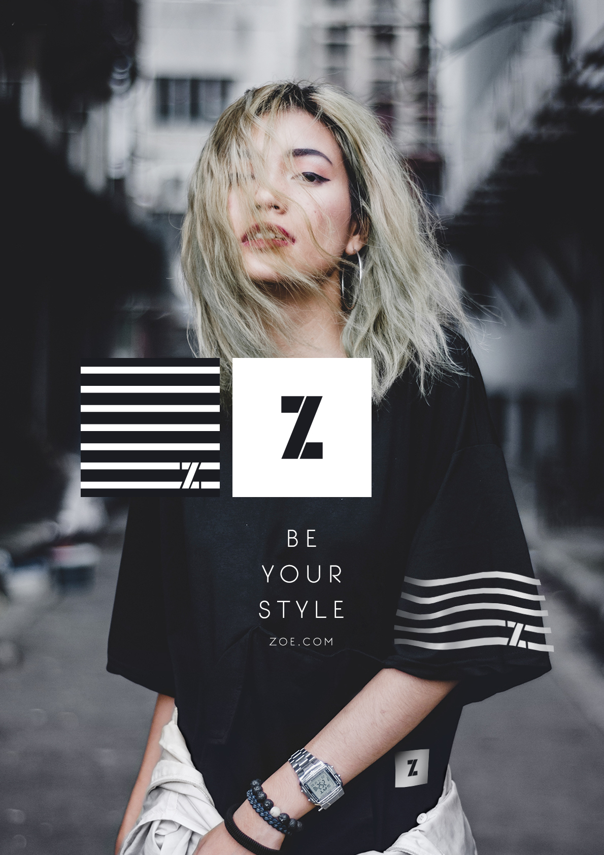
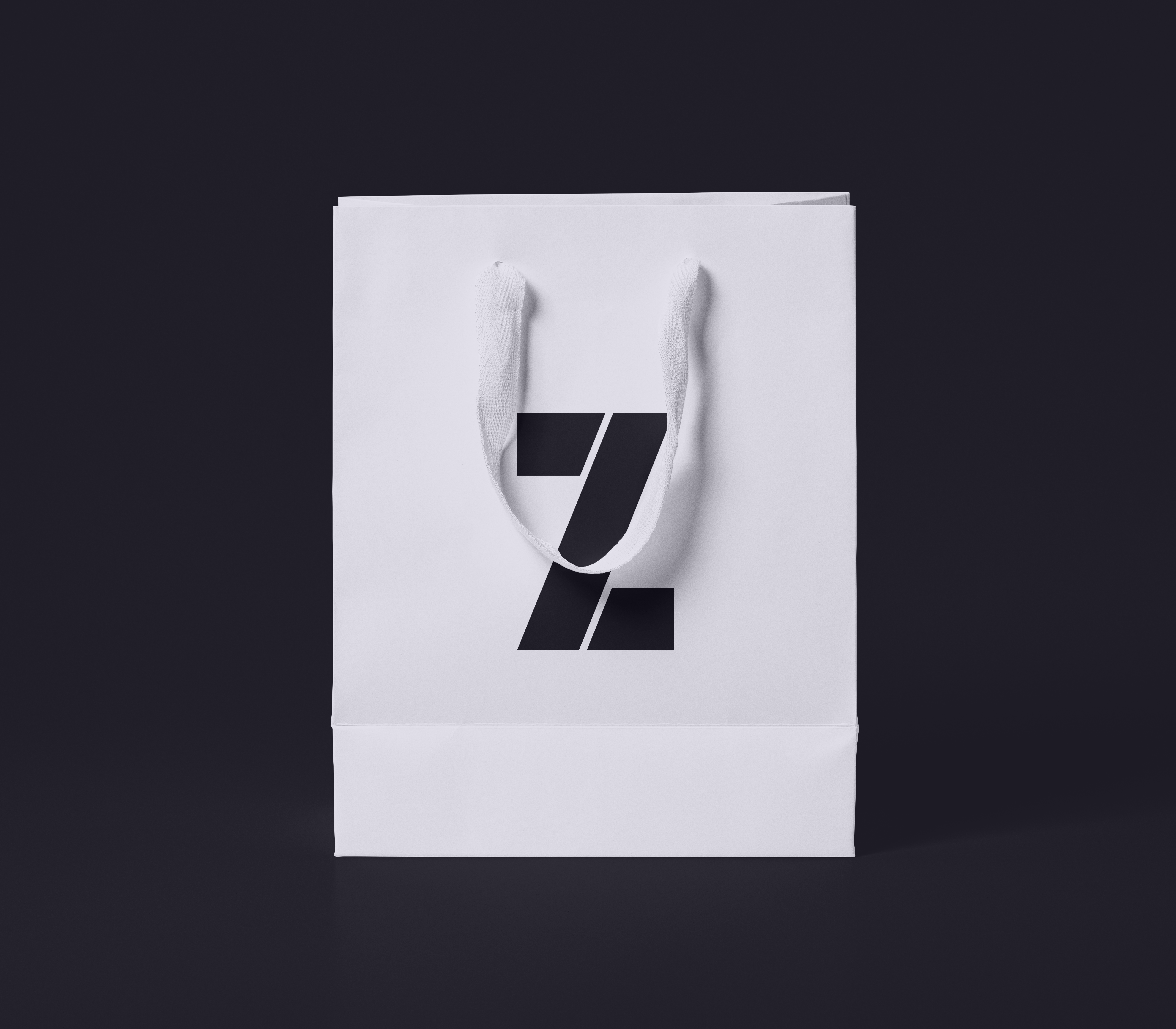
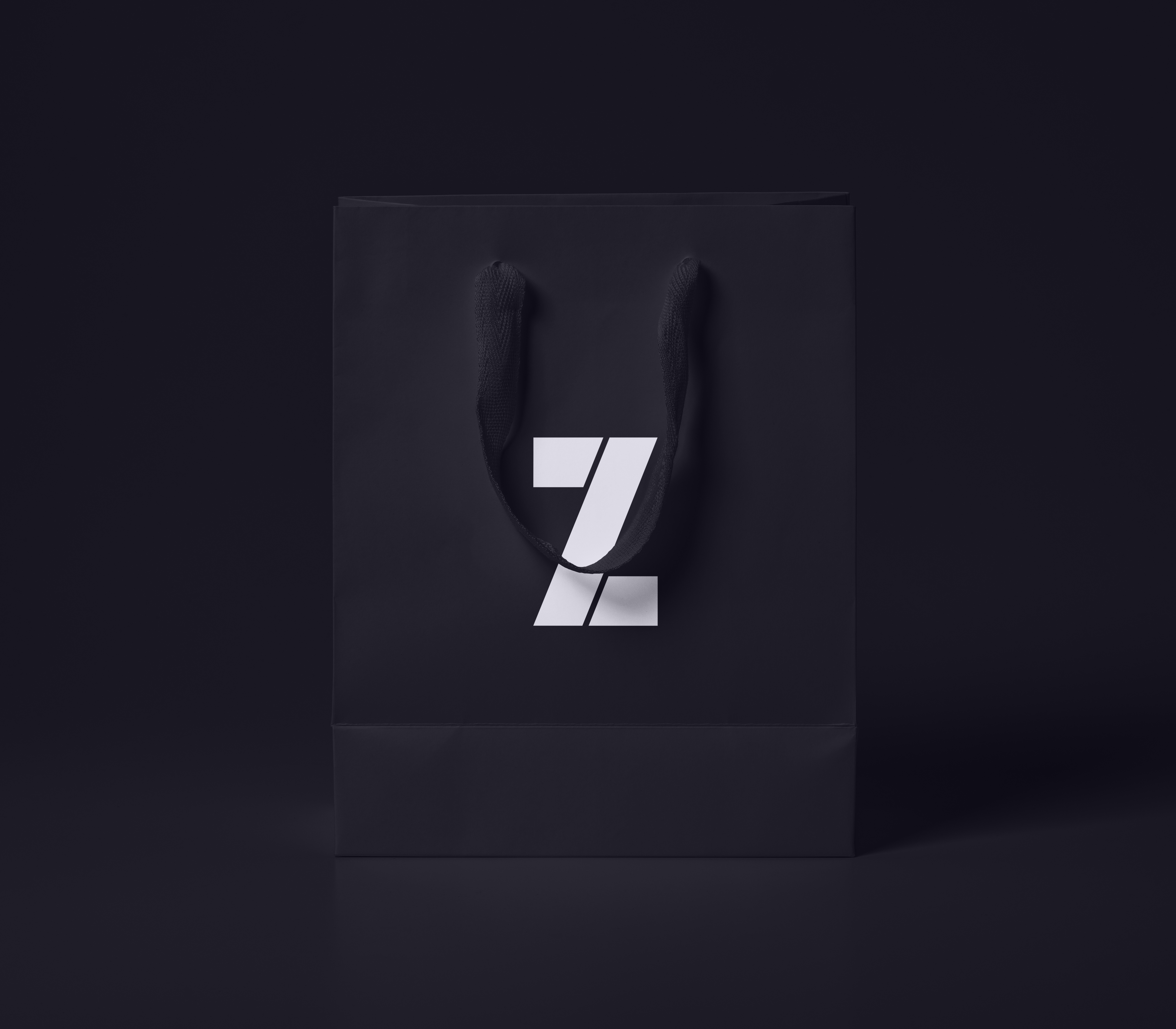
Logo
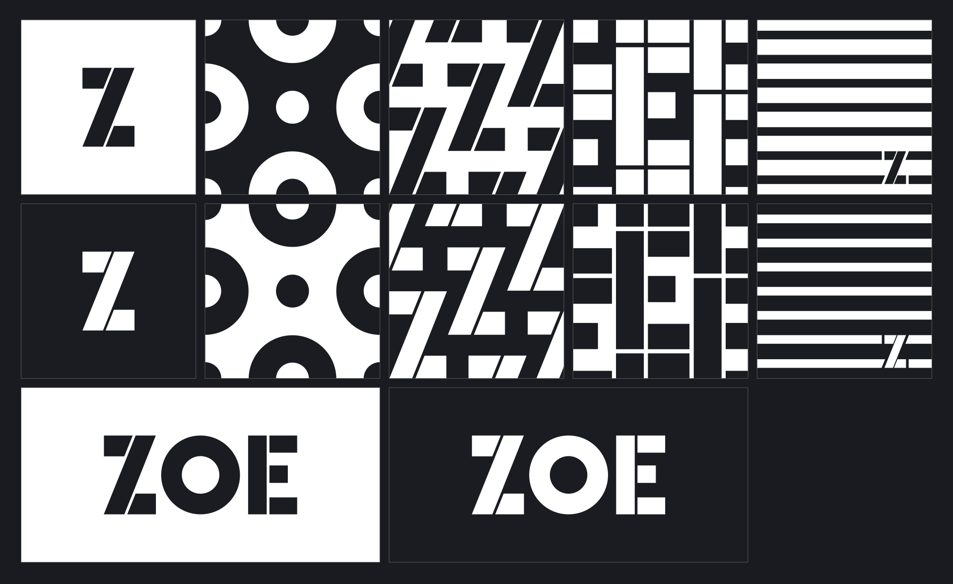
We wanted the logo to be bold and have a modern edge feel. I started with the Big John Pro font, this is a bold clean sans serif font. To bring it to the next level I modified the font, splitting it up into sections and changing the angle of the slanted edge to give it a taller more elegant feel. Once i had the wordmark created I used the Z in a simple square to create a bold emblem. Utilising the brand colours, to create light and dark variations.
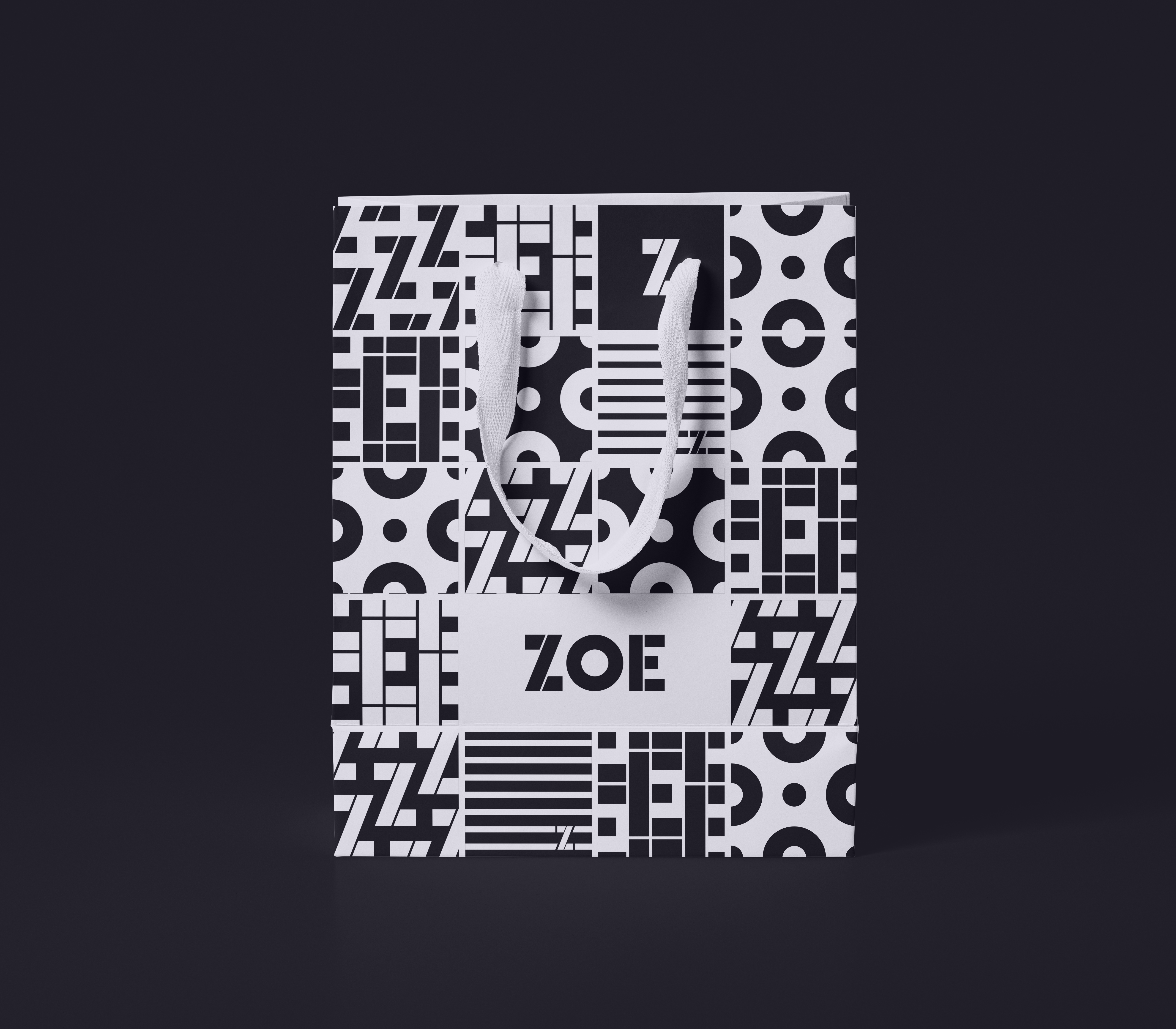
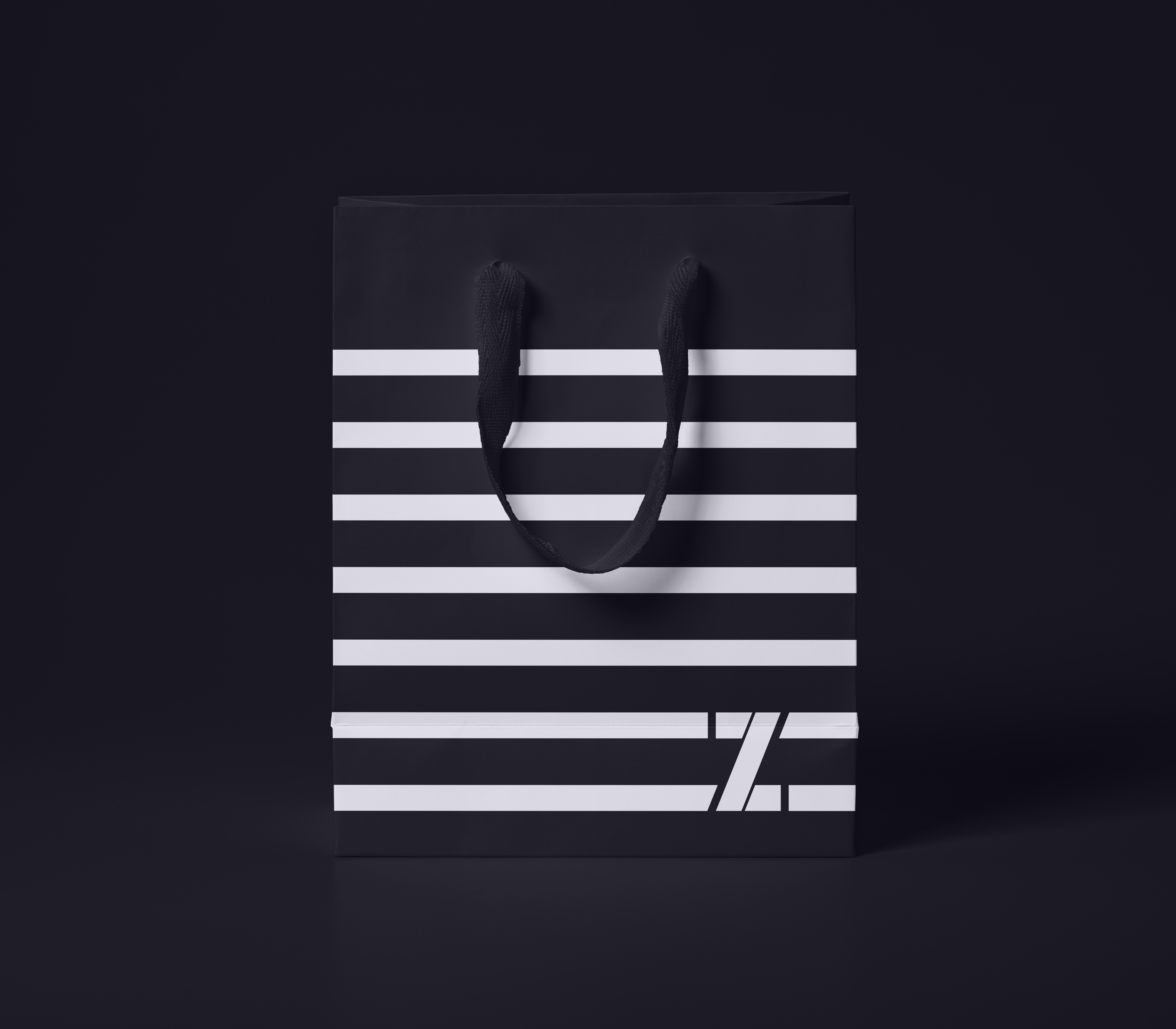
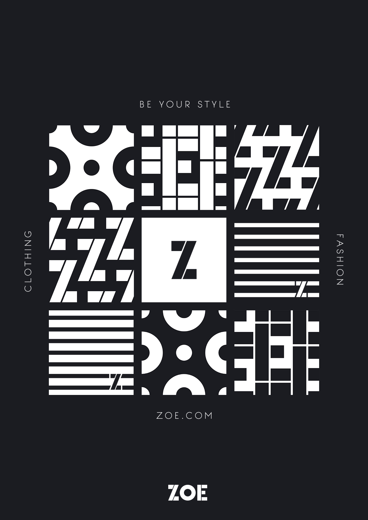
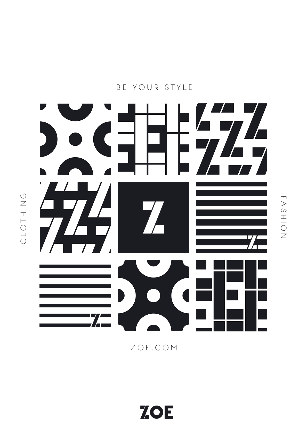
Pattern tiles
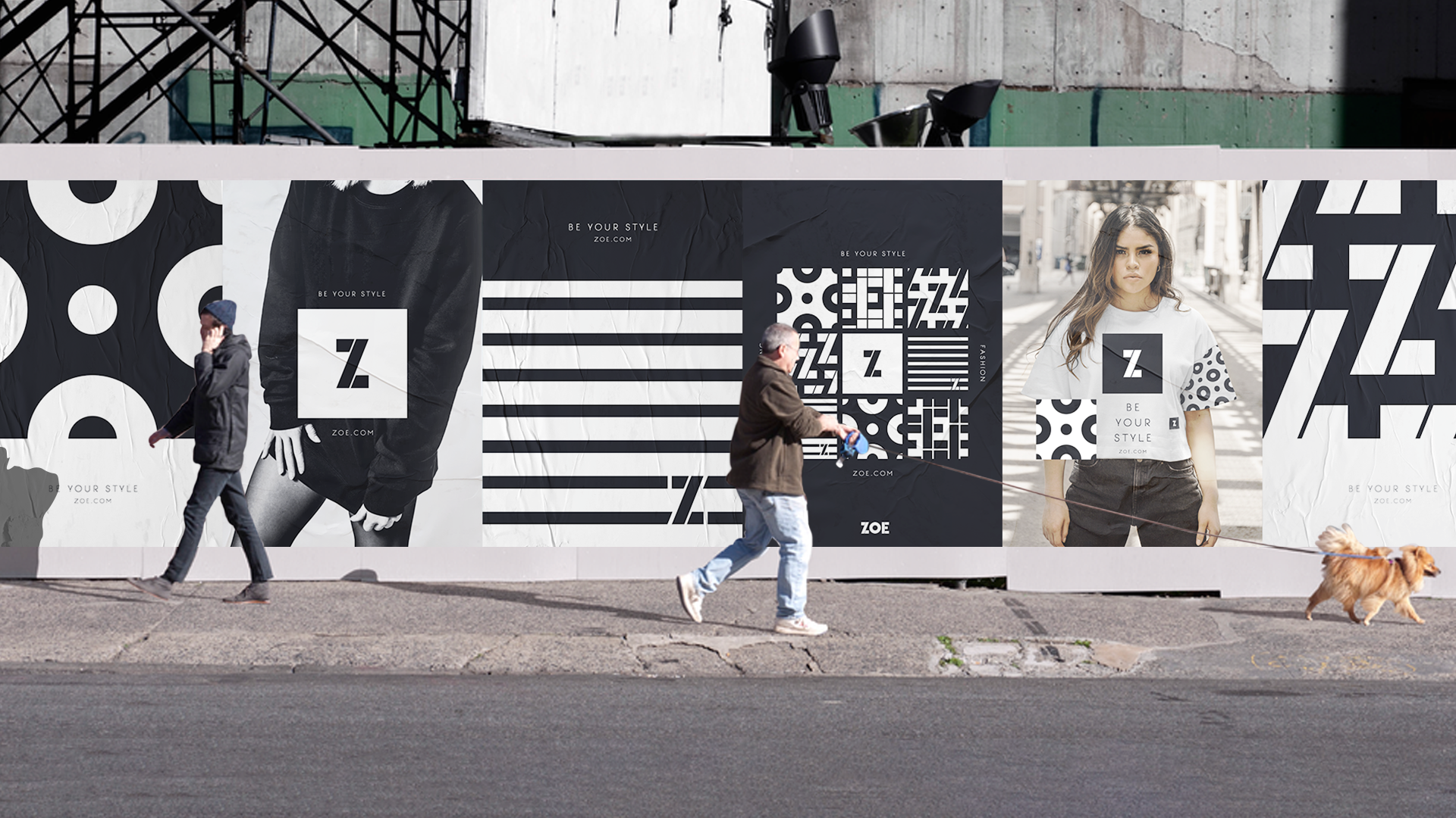
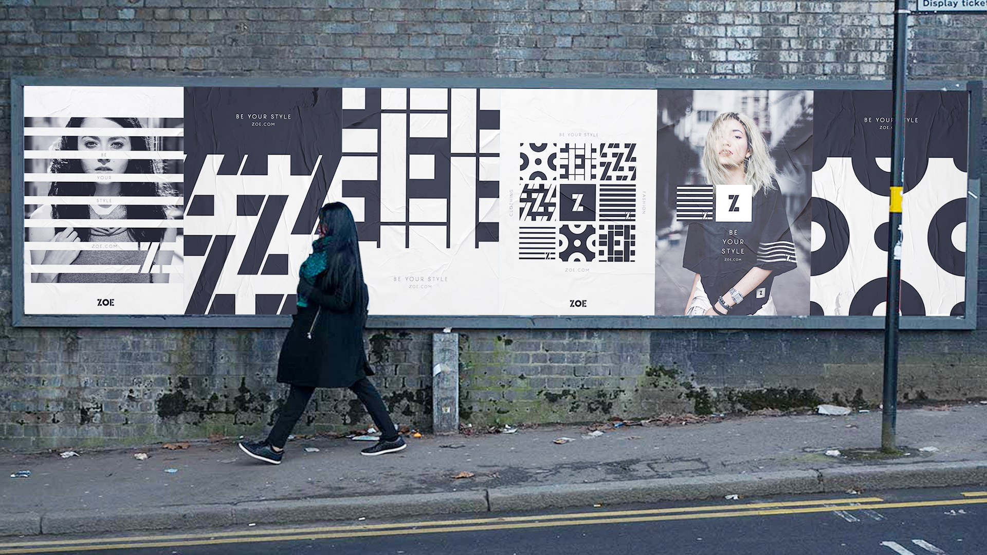
When it comes to creating a unique brand you have to look beyond the logo, in the fashion work the branding is as big as the clothes. To create a stand out brand I used the letters from the ZOE logo to create a series of patterns along with ones using the emblem and wordmark. These tiles allow us to create ever changing patterns that can be applied to everything from advertising to packaging and even in designing their own range of clothing.
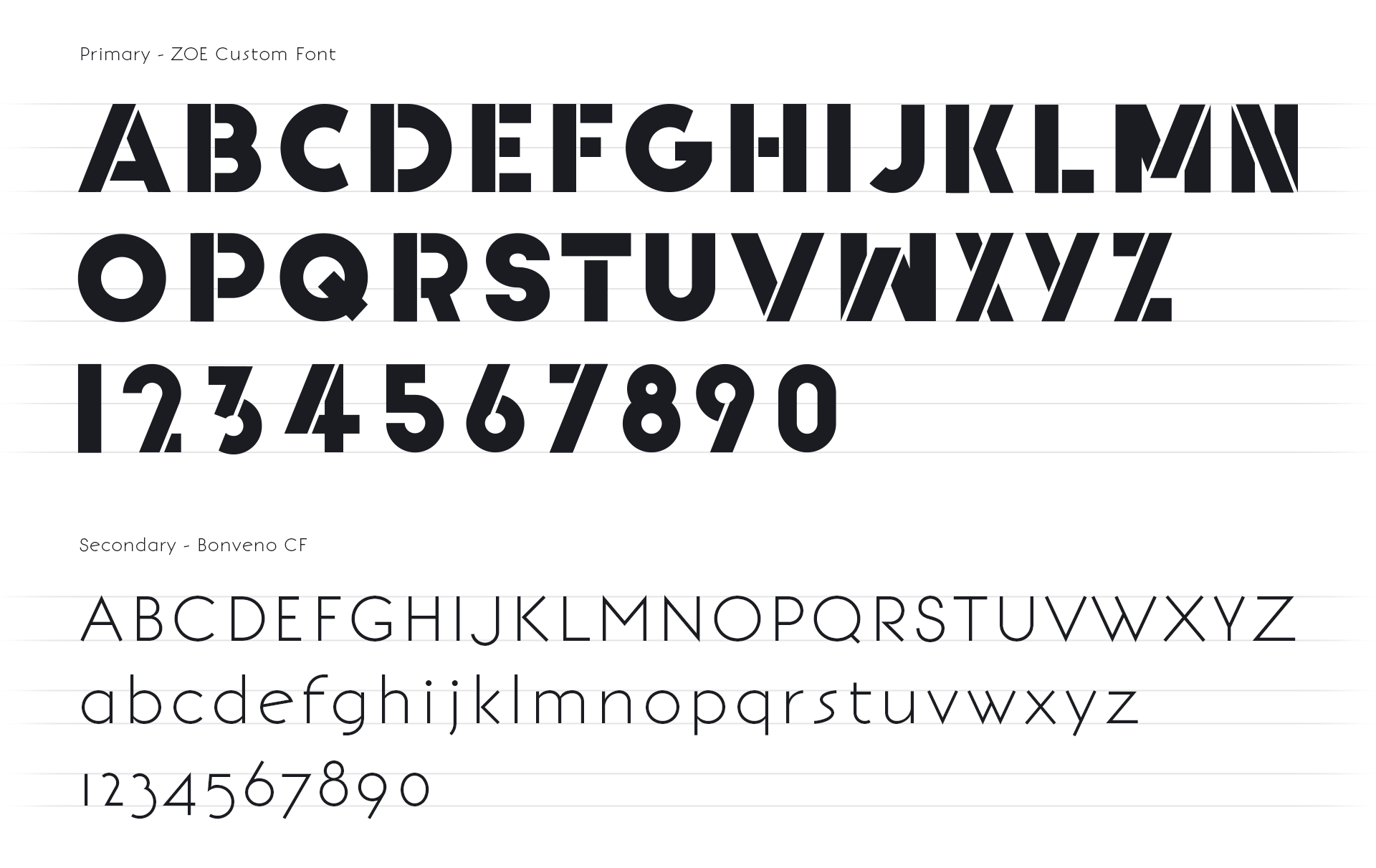
Typography
Like the logo, the starting point was Big John Pro font. I modified the font changing the angle of the slanted sides to match the Z in the logo. From there i split the letters along either the vertical edge of along the slanted edge creating this custom font. With the pattern tiles being the most prominent brand element, the font will be primarily used instore. The secondary font has a modern feel with elegant thin lines to balance the bold font and give some elegance when used with the pattern tiles.
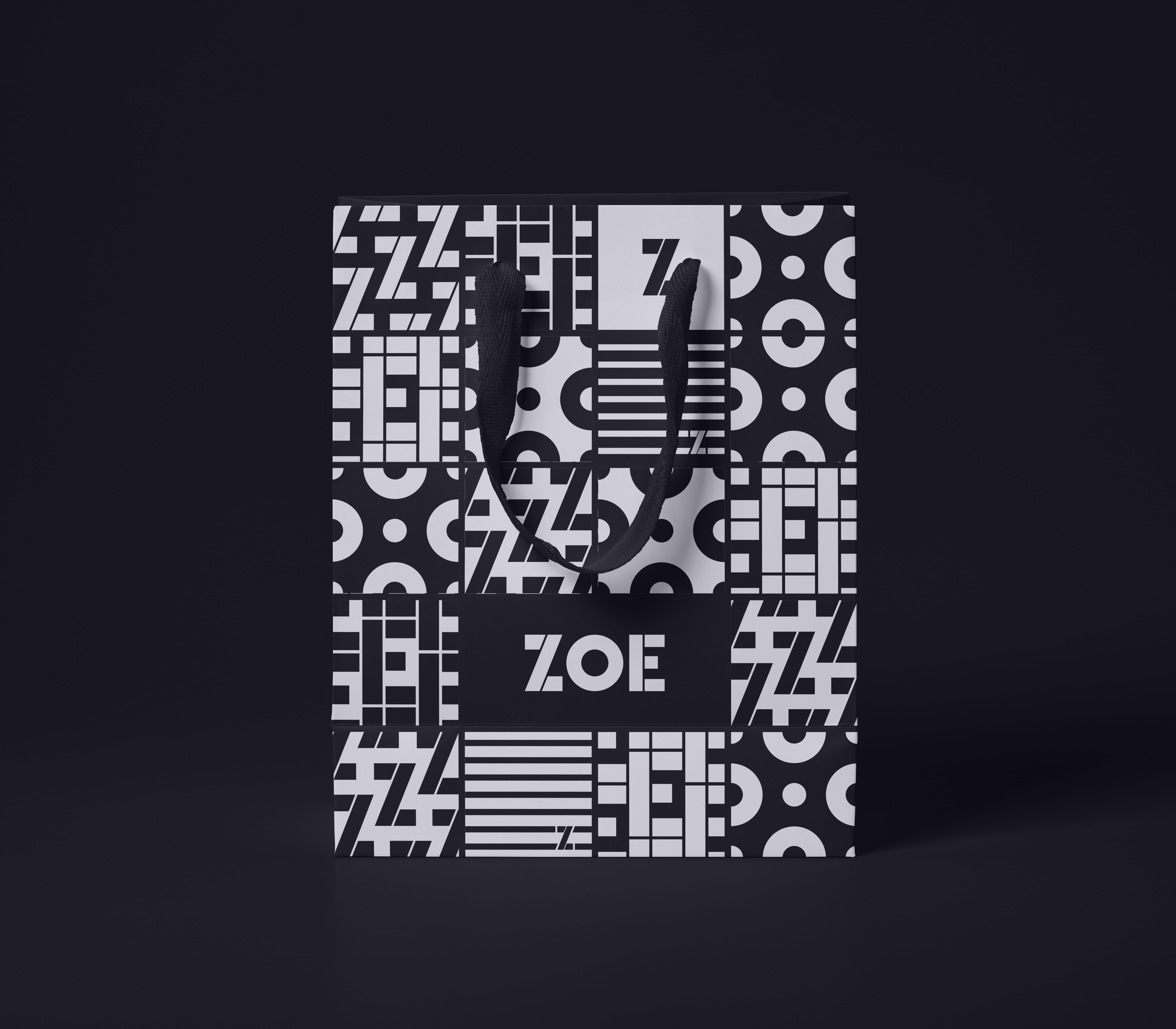
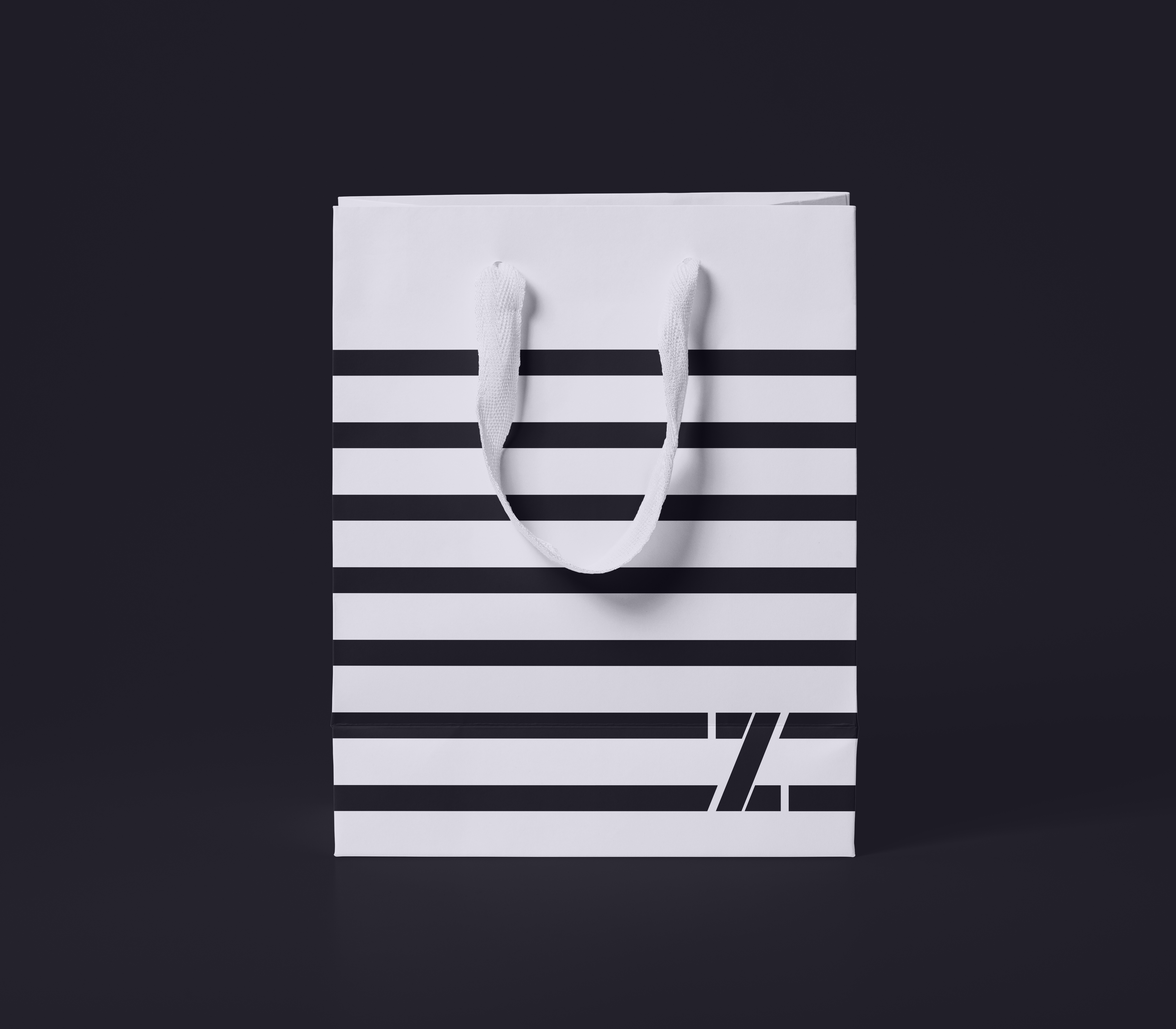
Packaging
Getting the brand out there doesnt end once you got them to the store, having packaging that uses the unique pattern tiles and bold style makes them an advertisement in themselves. When people see someone holding a bag with such striking looks, it makes then curious what it is and what to find out.